
An immersive audio tour app
This app was designed so visitors to May Gibbs’ historical house-museum had the option of a self-guided tour, as well as a tool for them to enjoy on site to enrich their visit.
My Role
UX Design
UI Design
Brand Design
Client
May Gibbs’ Nutcote
Tools
Figma

“The app Sarah designed is well researched and expertly delivered. It will add value to our small museum by providing an immersive experience for our customers, enabling them to experience the story of May Gibbs in the palm of their hand. Sarah has provided a custom solution, tailor-made for our business.”
– Megan Sadler, Manager, May Gibbs’ Nutcote
Project Background
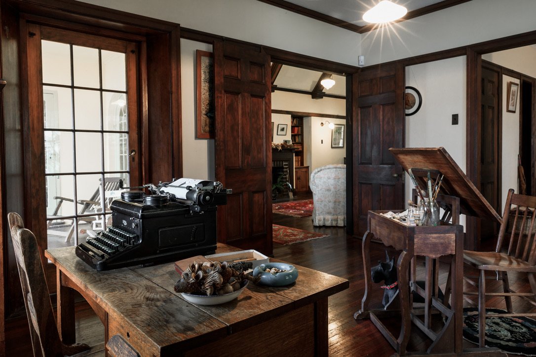
Nutcote is the historic harbourside home of May Gibbs (1877-1969), Australia’s foremost children’s author and illustrator, best known today for her iconic story, ‘The Complete Adventures of Snugglepot & Cuddlepie’.
The Problem
Entry to Nutcote is by tour only and happens a handful of times a day. A self-guided tour would allow more visitors through without having to wait, however Nutcote’s visitors are mostly elderly and struggle with technology.

Goals
An opportunity
This project began with the goal of creating an audio tour app. However after visiting Nutcote I quickly saw a strategic business opportunity to extend the scope and include additional content for visitors to enjoy during their visit.
For visitors to sit in May’s garden, her place of inspiration, and listen to her voice in a recorded interview – or to her stories – that would be truly special.
Project Goals
To create an easy, intuitive self-guided audio tour that the elderly clientele could use.
To create an enjoyable way for visitors to discover more about May Gibbs’ and enhance their visit.
Key learnings
1. Understanding user needs is everything
Empathising with visitors and conducting on-site research, interviews and usability studies shaped the whole direction of this project.
The insights I gained as a result meant I was able to better understand user needs, which had a huge impact on informing the functionality, content and design.
2. Bring the client along on your journey
Whilst I communicated my findings back regularly to the client, in hindsight providing them with more formal research results would have been a better way to help the client understand user pain points more deeply, as well as helping them understand the value of a user-centred approach and assisting them to get buy-in from internal stakeholders.

UX Research
Talking to visitors at Nutcote
I kicked off the project by going to Nutcote and interviewing visitors to understand their experience of audio tours, using apps, and the existing tour. I then created an aggregated empathy map from the interviews.
My assumption that their mostly elderly audience would struggle with technology was confirmed, and really made me realise how great an issue this was. This also got me thinking about how to simplify the experience and design. The people I interviewed were all deeply engaged with their visit, and keen to learn lots.
One person had recently done an audio tour they loved with geotagged content that played automatically when walking around, and minimal content on the console’s interface. There was also a separate tour for kids. This got me thinking about how this experience could be translated for Nutcote.
Pain Points
Accessibility of technology
Using a newly downloaded app for the first time can be difficult, confusing and frustrating.Navigating an app and exhibition
Figuring out where you are up to in an audio tour and within a physical location is confusing – and can result in lots of time looking at the app instead of the exhibition.Self-paced content
Visitors wanted to be able to revisit content or deep dive into information at their own pace.
“I just wouldn’t know what to do with an app. But if they explain or set it up, then that would be alright.”
“I struggle with QR codes and matching the information up.”
UX Research
Mapping out the User Experience
To ensure I understood the users I created some user stories based on the research I’d gathered.
Dorris is a senior woman who struggles with technology and needs an easy way to learn about May Gibbs’ life and home in depth when visiting Nutcote, because she cherishes her work.
Kate is a mother who needs a fun and enjoyable way for her and her son to experience Nutcote because they both love Gibbs’ work and are interested in learning more about her.


Competitor audit
I conducted a competitor audit, conducted competitor site visits and did an audio tour to better understand user experiences. The best competitor experience was an excellent learning by showing what good could look like – with simple, facilitated device setup, an easy-to-use interface, highly accessible content and iBeacons instead of QR codes or numbers.
A solution to improve usability
So users could focus on the audio tour and being in a new environment, I wanted content to auto-play as they walked around on the tour.
Using iBeacons would mean this was possible and users wouldn’t need to look at their devices, simplifying their experience – and greatly improving usability.
Wireframing
Paper wireframes were turned into digital wireframes with usability top of mind. User choices were split into simple steps to guide users through the setup process.
The iBeacons removed the need for visual cues between the location and app, meaning the interface could then be stripped back – and users could focus on listening, instead of looking at a device whilst navigating new surroundings.
UX Research

Usability Study
User insights
To understand if my design would resonate with users, I conducted a moderated usability study at Nutcote, with some participants who visited that day.
My goal was to find out if the app was easy to use, what the main challenges were in using the app, as well as finding out if the content in the ‘Learn More’ section was useful and of interest.
Key Insights
Users were happy with the ease of use and simplicity of the navigation from the iBeacons.
Users were unlikely to return to the app, so the app should be focused on on-site activities.
The ‘sounds’ content should be reworked and directed to children.
Users wanted faster ways to donate with fewer forms to fill out.
Users will be on site when using the app, so a physical donation ask should be added.

Proof of concept
The simplicity of the design for the audio tour section resonated really well with users. They loved the simple interface and the fact they could concentrate on enjoying the museum without needing to fiddle with a device. Furthermore, they felt the app was accessible for people who struggled with technology. The only concern was that the tech would do what it was supposed to and work correctly.

Insights to Iterations
Insights from the usability study informed several changes to improve the app’s design. Adults were confused by content aimed at children, so a specific section for children’s content was added. After conducting on-site usability testing I also realised that people could of course donate physically, and a physical donation ask should also be added.


Whilst at Nutcote, I observed a woman’s child in the tea room watching her mum’s phone... and thus had the idea to add some video content for kids.
There was a suggestion from my user interviews to add social share functionality, after some thought on how to do this creatively and in a way that would enhance the visitor experience (and that users would want to share), I added a sharable branded Nutcote photo frame to link to the phone’s camera.
This was very well received in the second testing.

“The photo frames - that is the cherry on the top for the app to be able to do that!”
"That's fabulous, great idea – that's really good. Beautiful."
Branding
In addition to the interface design for the app, I was also responsible for refreshing the Nutcote brand. This included refining and realigning the logo, and developing an overall visual language through type, colour, a frame mechanism and May’s overlaid illustrations.
“Sarah re-imagined our tired brand and has created for us a beautiful logo and style guide that perfectly captures the essence of our brand.”
– Megan Sadler, Manager, May Gibbs’ Nutcote


The final iteration (for now)
The design of this app was very well received by Nutcote’s visitors as it offers a deeper way to enhance the visitor experience at a pace that’s right for users.
This app is seeking funding for development. Nutcote is a small non-profit organisation largely run by volunteers and funded by donors. If you would like to help make this happen, please get in touch.
“I like that it's very non-techy and feels simple, clear. A lot of people won't know May Gibbs and the app brings it to life for them - and has the prospect of giving people that special connection, to nature, to the gumnuts, to May’s stories, to the Australian landscape. I think it's a great idea."
– Participant from usability study

“It’s very simple, it has a beautiful feel about it that reminds me of this place. The whole visual aesthetic of this place is very Nutcote. It’s gorgeous.
And it’s easy! Easy to navigate and get information from.”
– Participant from usability study